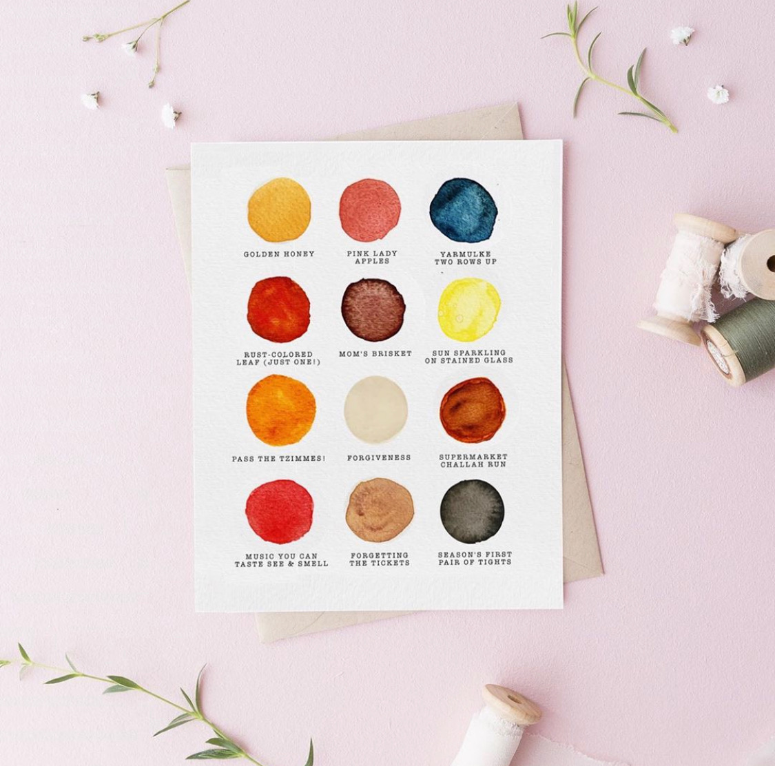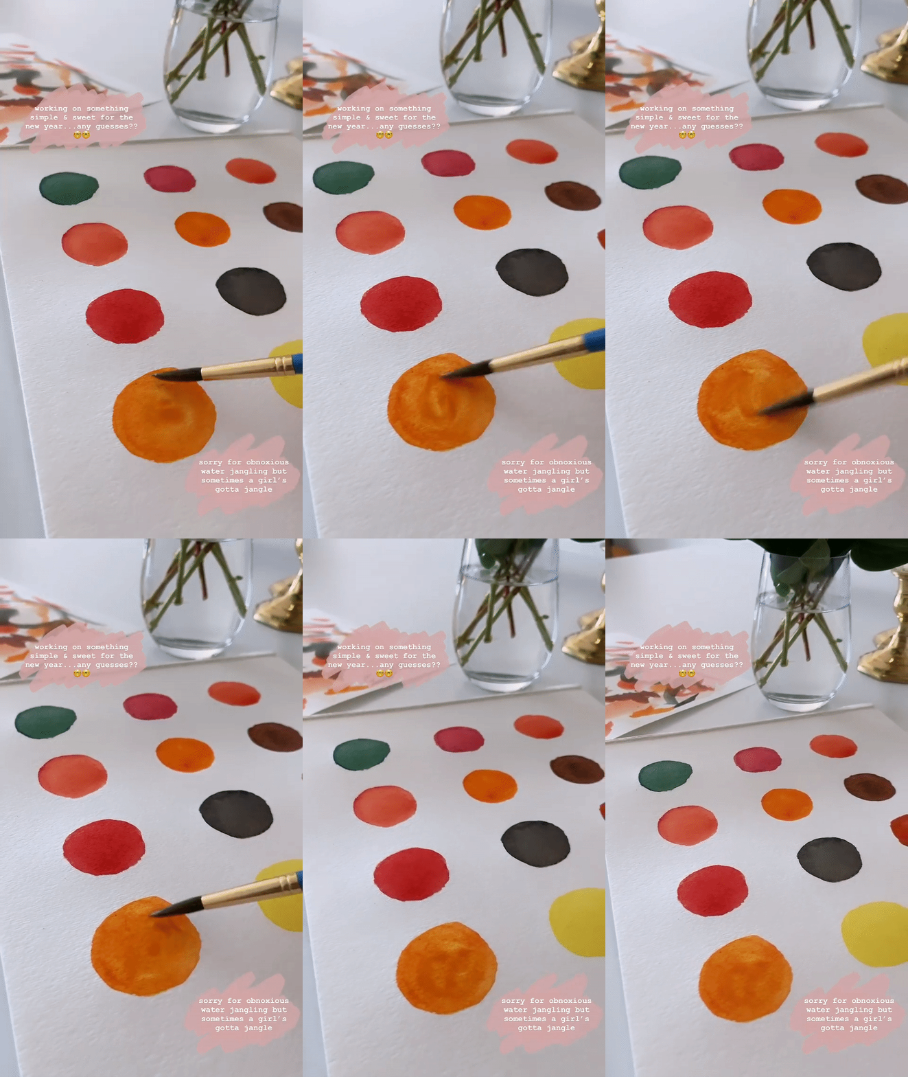
So, I actually made this Rosh Hashanah “palette” card last year…but never actually got around to posting a tutorial because at the time, it was just a for-fun thing I put together for my own friends. But this year, I thought I’d bring it on over to the blog because 1) I feel like many of you would enjoy putting together something like this! And 2) I’m going to be leading a fun workshop with OneTable and JCC Manhattan on Friday, August 28 all about this exact card; you can find more information and sign up riiight over here.
The most important thing for you to know about this DIY is that it was inspired by the creative, wonderful team at Mr. Boddington, which is this really charming, Brooklyn-based design studio that specializes in cards and prints. They have this adorable wrapping paper that I once spied at Paper Source (where, when the world was a little more normal, I used to spend an INORDINATE amount of time), and I remember staring at it and thinking how cute it’d be to make a similar “palette” for Rosh Hashanah.
The rest is history!
Oh, but the SECOND most important thing for you to know about this project is that it may be tough to replicate this exact card at home. Mainly because I actually added in those “typewritten” letters digitally after scanning the painted paper into Photoshop.
But you can—and should!—make a very, very similar version using this as a jumping-off point, so I encourage you to take a cue from the basic gist of my process here. It’s such a fun, relaxing way to reflect on what the holiday means to you. (And such a cute project to try with kids, too.)
Below, find some tips for creating a card like this one—and remember to join me on August 28 if you’d like to craft these together! 🙂

First, gather your supplies.
I’d recommend the following:
- A notebook (just so you can jot down notes about what you’d like to include in your palette)
- Thick watercolor paper (to practice on!)
- Pre-folded watercolor cards or postcards (for your final masterpiece),
- A very simple watercolor palette (there’s really no need to buy any fancy art supplies for something like this—remember, you can mix colors to make whatever specific hue you’re looking for)
- A paintbrush (again, nothing fancy; anything works. And the palette I linked above actually comes with brushes, by the way)
- Any fine-tipped black pen
- A ruler (helps with writing in a straight line)
- A glass of water (of course—for the watercolors!)
- Newspaper to protect your work surface
Next, dream up your personal “Rosh Hashanah palette,” selecting 12 memories or motifs and assigning each of them a color.
What colors remind you of the High Holiday season? Are there certain foods or memories associated with Rosh Hashanah that you want to include? Write down your list, then assign each “thing” a color. Try to get specific about it! A leaf, for instance, might not just be “red”; maybe it’s more of a “rust” or “brown-ish orange-ish red.” Forgiveness may not be “white”; maybe it’s sort of a “murky, creamy white.” And so on.
Oh, and the things that make up your palette don’t have to be literal, either. Some of mine were things like “music you can taste, see, and smell” and “forgetting the tickets.”
If you get a little stumped, I suggest Googling / Pinterest-ing around for images of fall scenes, flipping through magazines, thinking back to Rosh Hashanahs past, or calling family members to reminisce together. All of these are easy ways to get some inspiration.
I probably spent waaaaay too long mapping out my own palette when I made these last year. It just becomes this super interesting, thoughtful exercise. You’ll see. Have fun with it!
Use a ruler and pen to write out the names of your chosen colors.
Or you can get professional about it and try printing out the names onto that thick watercolor paper (with the help of a local printer, maybe?) before getting to work painting. It’s really up to you. Again, I did this part digitally, so I’m excited to see how we all make it work by hand this year.
I’d also suggest trying to keep things “in line.” A ruler can help with that. What I find so alluring about the Mr. Boddington wrapping paper is the fact that it’s equal parts whimsical/silly AND ultra-sophisticated. Those little painted circles are placed at such distinct, even intervals.
But, again, do whatever you want and go with the flow; it really doesn’t need to be perfect.
Paint, dry, and share!
If you want, you can follow my lead at this point and scan or make copies of the final product in order to duplicate it and send out to as many friends as possible. You can also just scan it, and instead of re-printing, send it around via email. Or you can just ship out that one lovely original card you’ve made and call it a day. The options are endless. 🙂
And that’s that! Can’t wait to see what you all do with this little spark of an idea. Don’t overthink it; just have fun and enjoy the process!!
L’shanah tovah! I’ll see you on the 28th. ✨
